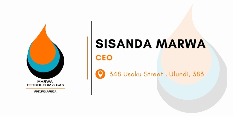
This logo is an abstract, modern design intended to represent energy, movement, and stability for a company operating in the petroleum and gas sector. Core Concept: The overall shape is a dynamic, abstract mark. It appears to be a stylized representation of a fluid droplet or a moving flame, which are core visual metaphors for the petroleum and gas industry. The Overlapping Curve: The way the shapes overlap suggests movement and continuous flow, which is vital for any company involved in energy distribution and transportation. The curved lines add a sense of modernity and progression. The "Marwa Petroleum & Gas" logo uses a simple, bold combination of dynamic shapes and high-energy colours to represent a modern, reliable, and forward-moving company in the energy sector. The orange represents the product (energy/gas), and the blue provides stability and trust.