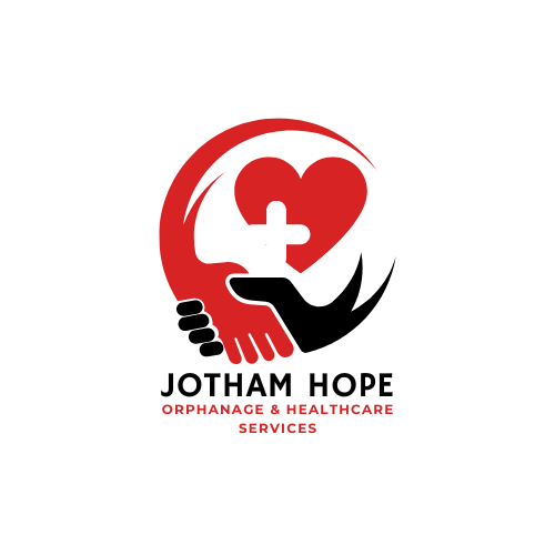
This logo is designed to communicate care, support, and medical aid for vulnerable communities, specifically focusing on the orphanage and healthcare services provided by "Jotham Hope." The Embrace and Hands: The primary visual is two stylized hands forming an embracing circle around a central shape. This universally symbolizes protection, unity, and support, reflecting the care and compassion offered by an orphanage and a healthcare service. The Central Heart and Cross: The large red heart represents love, charity, and life. The overlaid white cross is the universal symbol for healthcare, first aid, and medical services. Together, they powerfully signify the organization’s dual focus on loving care and medical intervention. Colour Palette (Red, Black, White): Red: Stands for passion, energy, life, and urgency, often associated with the medical field and the heart. Black: Provides g rounding, strength, and professionalism. White: Represents purity, hope, and light, particularly in the context of the cross. Typography: The bold, sans-serif font for "JOTHAM HOPE" suggests stability, trust, and clarity, while the smaller red font for the services adds context and reinforces the medical connection. The logo is a clean, dynamic mark that promises hope, healing, and heartfelt support.


-1.png)
-2.png)
-3.png)
-4.png)
-5.png)